CometWar
An airhockey on a big screen with two phones
#GameDesign #UX/UI / Platform: Win7 (Microsoft PixelSense) & iOS9 (iPhone 7)
Nov 2016 - Jun 2017 / BFA Thesis / Instructor: Dr. Qiong Wu
Teammates: Yicheng Zhao, Mengzhu Ouyang, Yanhang Jin
My key roles
interaction design, motion design, game mechanics
THE CHALLENGE
How would you make a fun project to show information flowing between screens based on given devices?
THE OUTCOME
CometWar, a two-player air-hockey game with a cosmic theme based on a large screen and two phones. It introduces a novel mode of interaction as an arcade game, and gives personal phones double roles—both controllers and gamers' IDs.
probe
Information "flowing" among screens
Numerous screens surround us, showing the potential that they can interact with each other. We were offered a 30-inch Microsoft PixelSense touch table, and asked to design an experience to demonstrate how information could flow between the big screen and smaller phone screens.
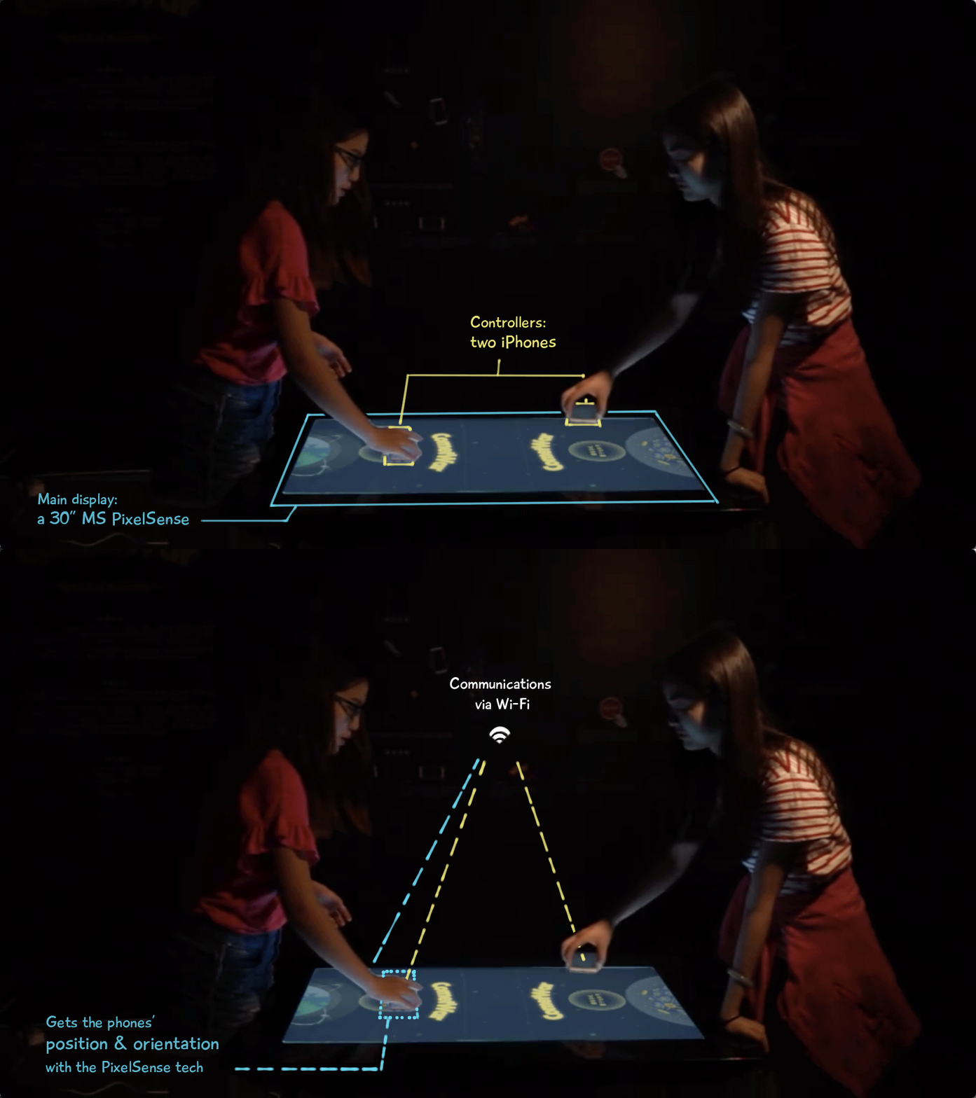
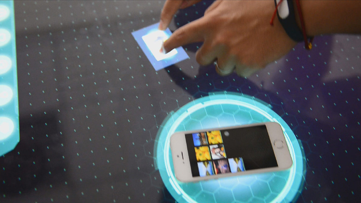
Two gamers stand on each side of the space/PixelSense, surfing the spaceships/iPhones on the table, attacking the other's planet and protecting theirs by kicking a comet come-and-forth. The personal phones are both IDs and controllers.
response
Air hockey game with two phones on a "table"
We presented CometWar, a two-player air hockey that operates synchronously on the PixelSense and two iPhones.
elements
Obstacles, skills, and other rules
On top of the basic rules, we designed obstacles and skills to add spice and control the duration.
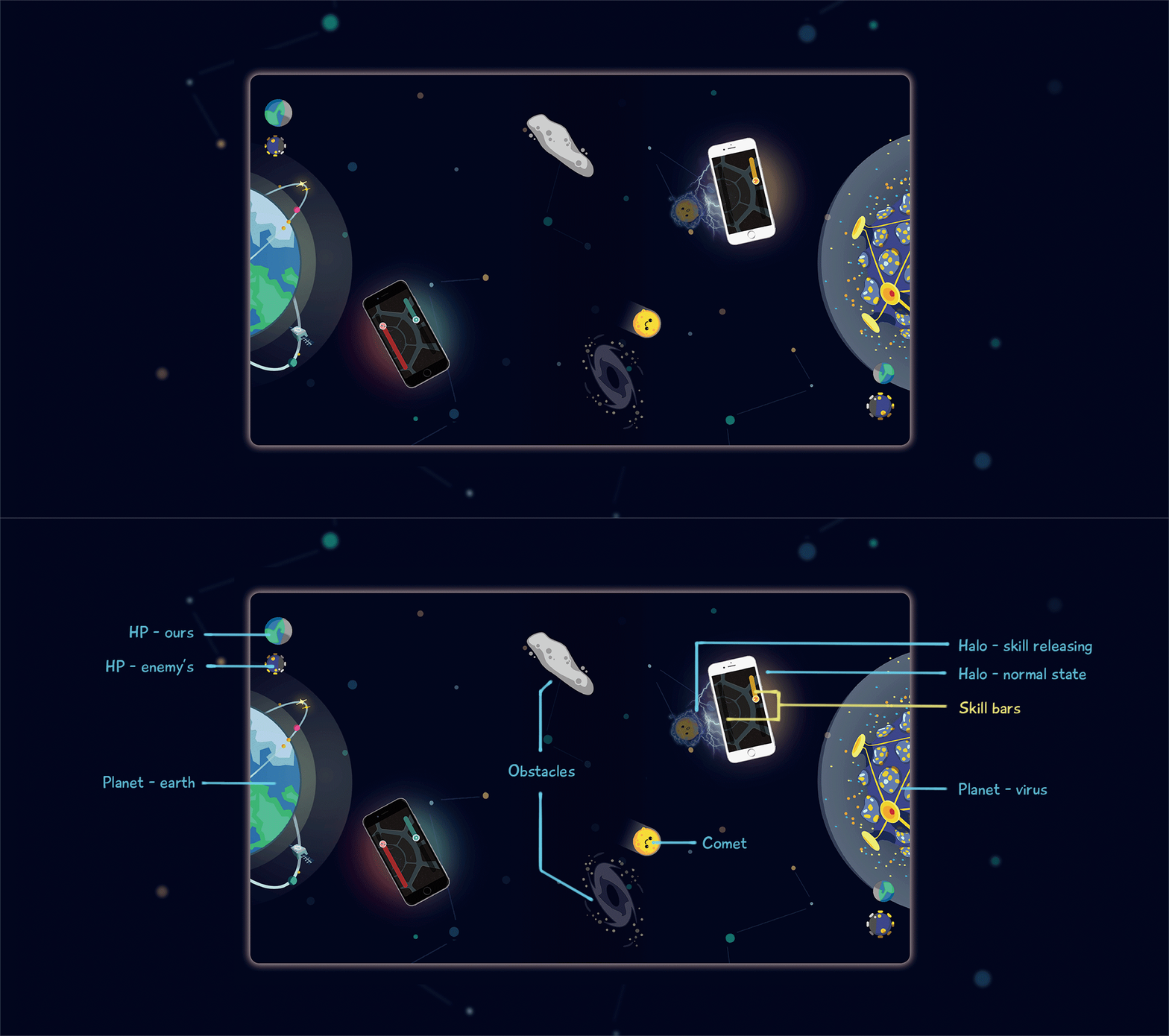
There are also obstacles in the middle that influence the comet's movement. The spacecrafts also have different attack/defense skills. When a spacecraft is attacked, or it goes across the boundaries, the gamer need to shake the phone to restore energy. The winner will be determined when his/her opponent's HP reaches zero.
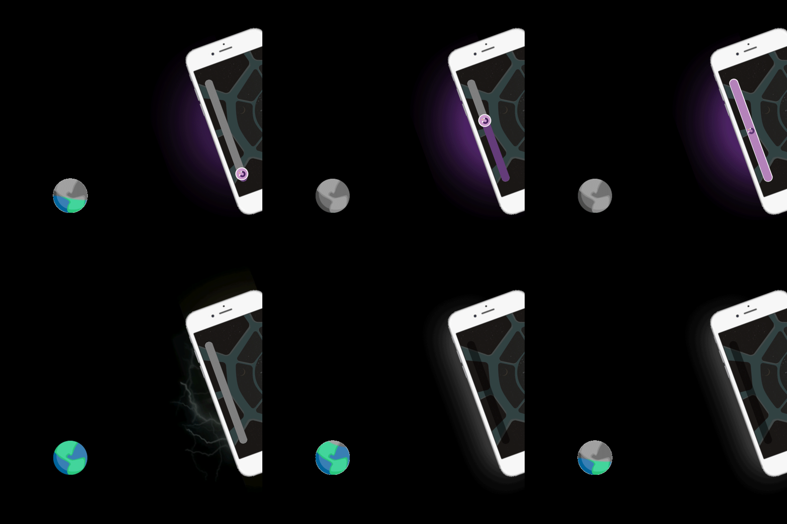
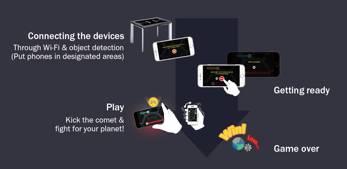
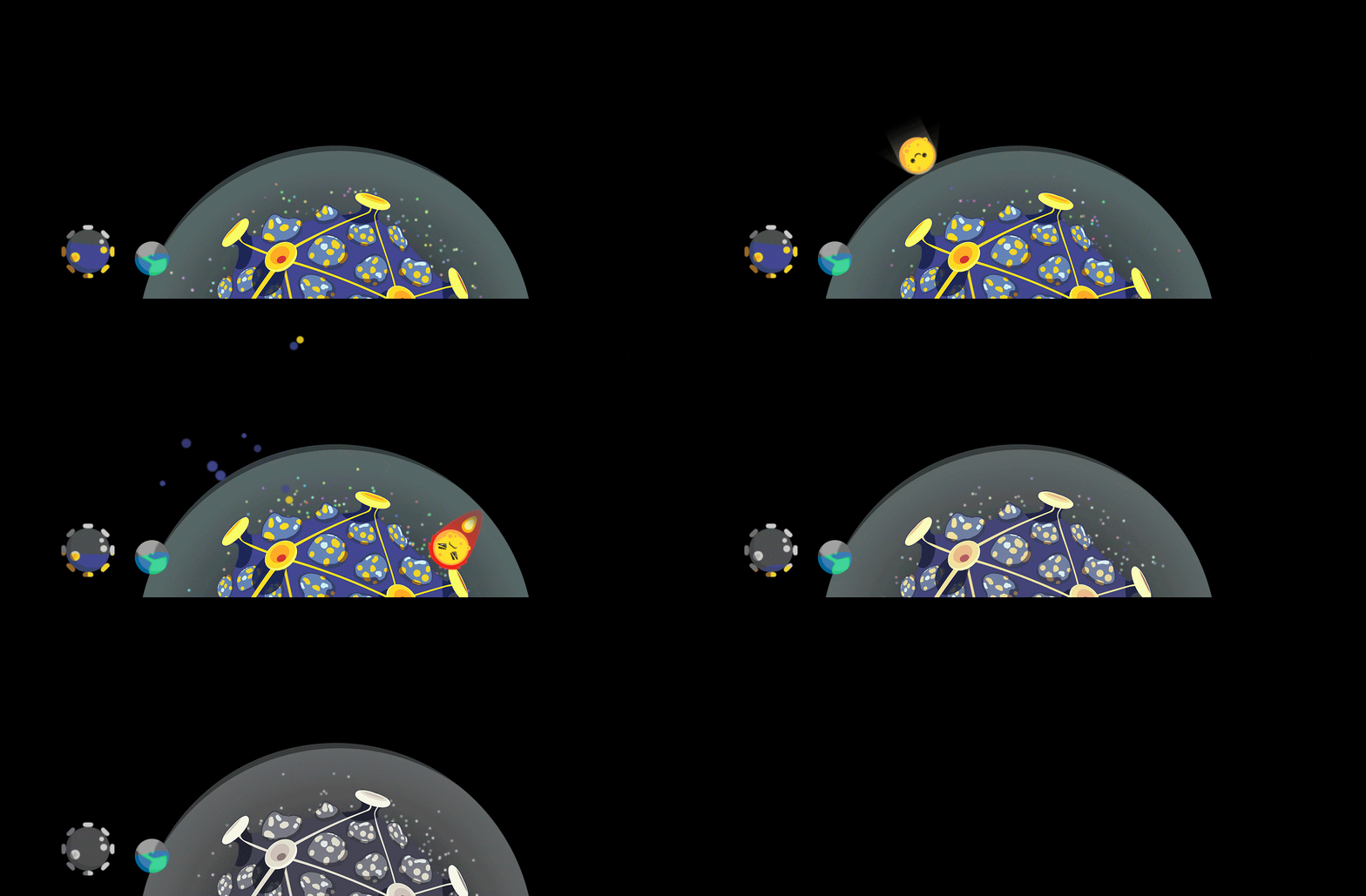
Left: motion design examples. Right: general interaction flow
Left: motion design examples. Right: general interaction flow
my roles
my roles
Designing the gaming experience
The team developed the game mechanics together.
As the only interaction designer, I:
— identified design principles concerning usability and overall gaming experience;
— designed the user flows, gestures, and other components;
— drew half of the visual elements.
Overall Process
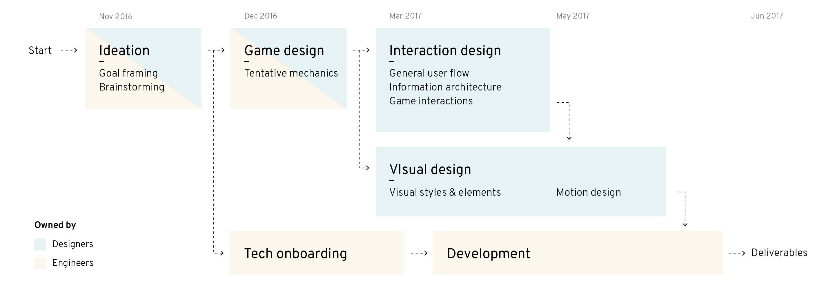
In summary...
What I learned:
- project management,
- designing to demonstrate technology,
- and looking for solutions and trying new tools along the way
If there were more time, we could...
- do more user tests to optimize the numerical system for game balance,
- think more about the exhibition design, particularly because the device has a strict requirement for the light,
- and code the program until it is more consistent with the design.
For process in detail, please view on a larger screen.
Process in detail
Ideation

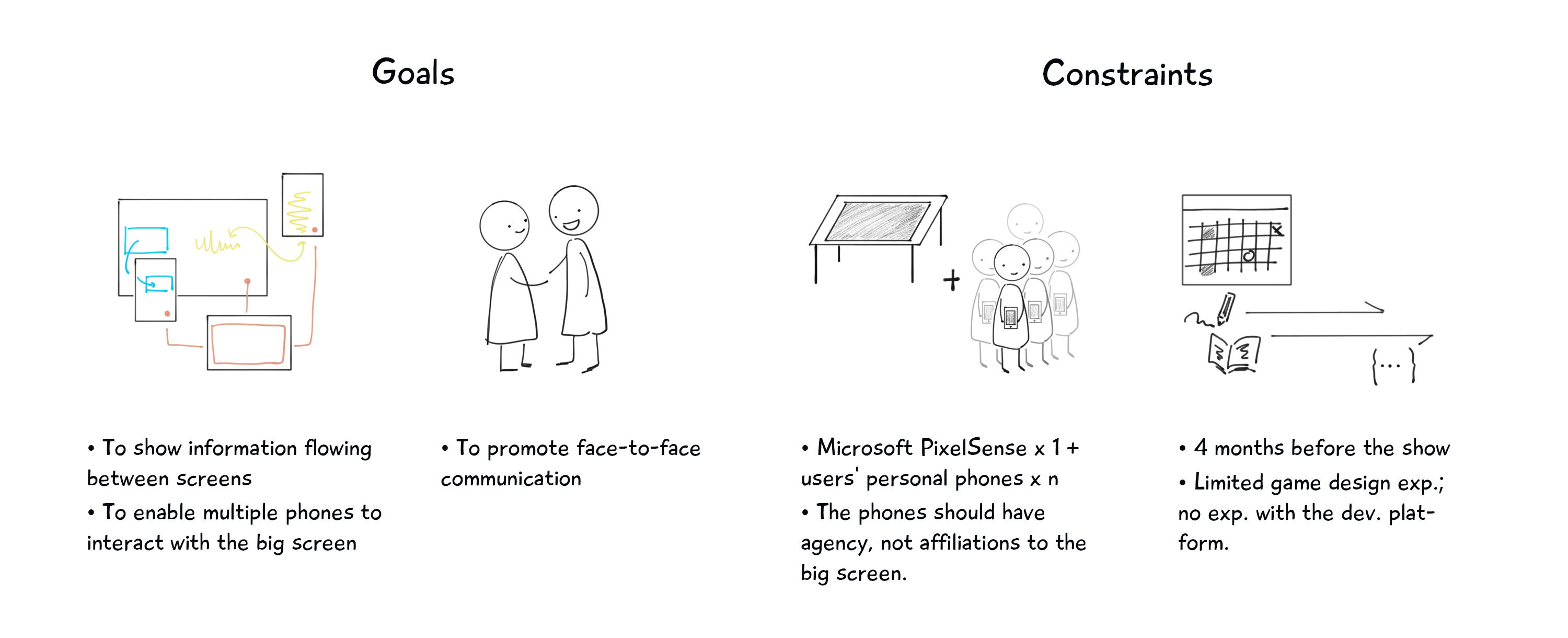
1. Framing the goal
To start with, we identified the goals and constraints of the project.
2. Brainstorming
Then we came up with ideas of whatever type: games, tools, installations, or any other experience.

3. A simple idea
The team decided to move on with the "augmented PONG" idea, because it was simple, entertaining, and able to communicate the idea of "flowing information."
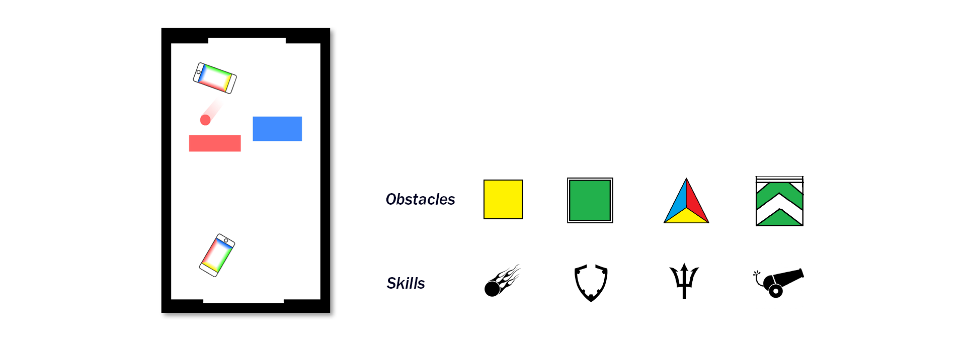
The preliminary sketch of the game, showing the interface during the game, and examples of some obstacles and skills which may help accelerate the game while keeping it balanced.
4. Game mechanics
We proposed CometWar, a digital air hockey game set in the cosmos. It would upgrade the air hockey game with screens, while keeping it tangible and face-to-face.
We tried to balance the game and control the length per session by adding variations and setting restrictions to the skills, adjusting numbers of obstacles as time goes, etc..
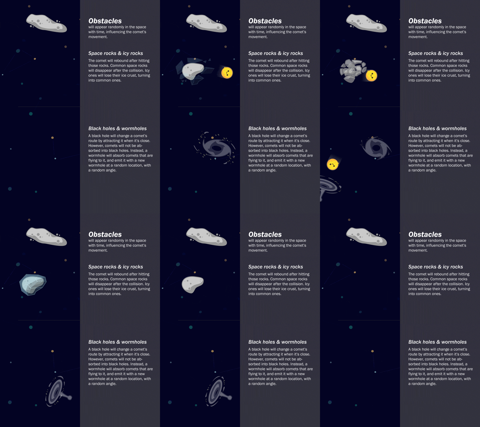
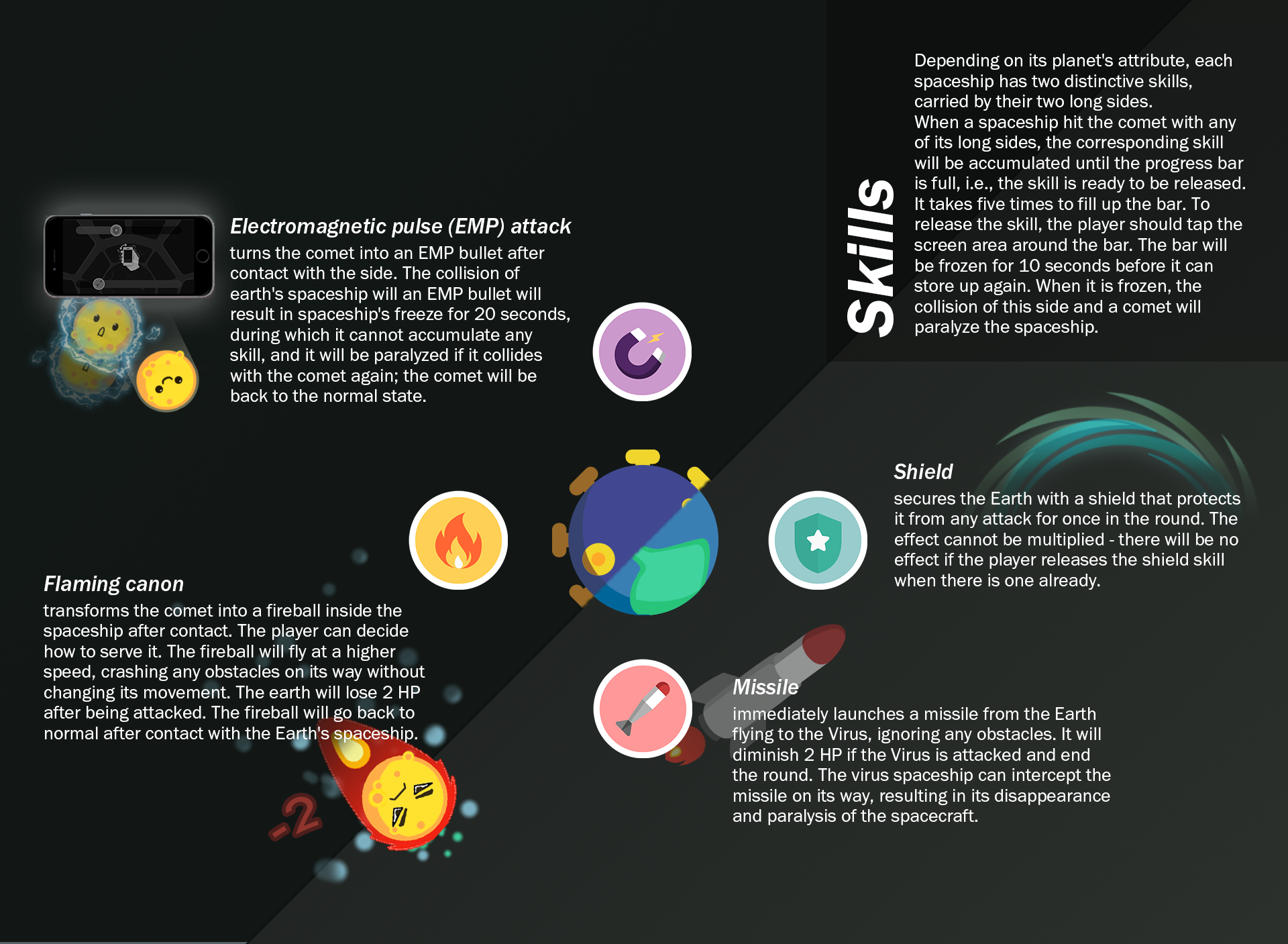
Rules to add spice, balance the game and control game time.
Interaction design
I began by designing the overall experience, thinking about how gamers would interact with the devices. Then, to make it complete, I designed the overall flow from connecting the device to the end of a game.
Concerning usability and gaming experience, I figured out the following design principles and complete the design accordingly.
-

Principle 1
Limit the information on phone screen

It's distracting to skipping between screens. Thus gamers should focus on the table and the opponent, not the tiny phone screens.
Since the game runs on three devices at the same time, it should be explicit that each device has a role, where information and interactions would be appropriately assigned.
By testing with my team, I found it distracting to operate on a phone while playing in the whole system. As a result, most elements will be shown on the large screen.
Principle 2
Phones can be slid, shaken, or tapped
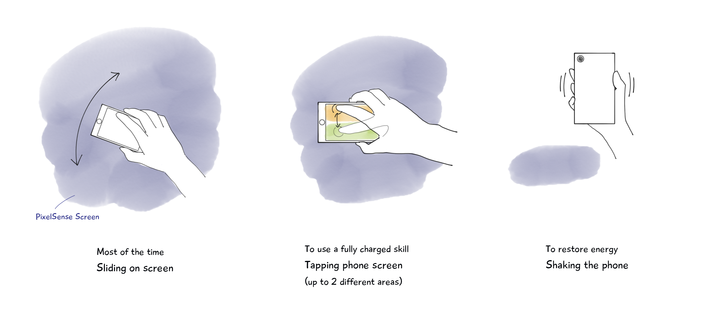
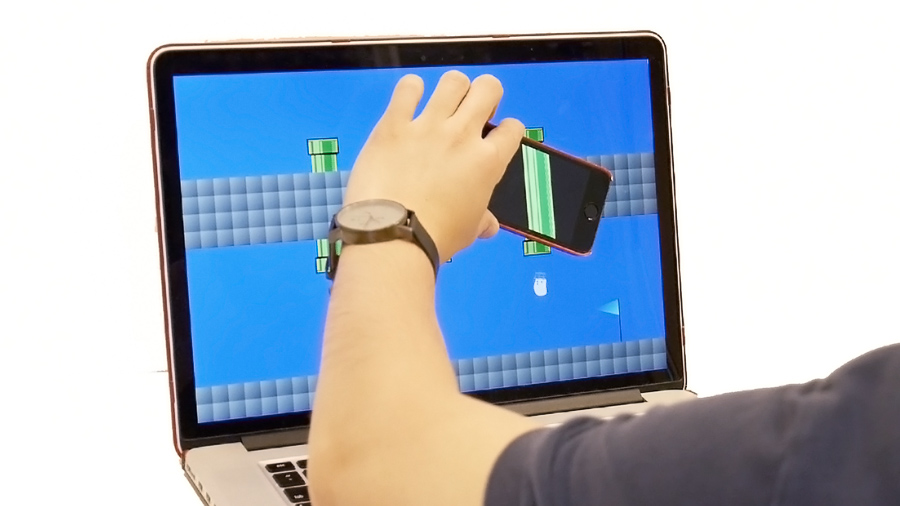
What interactions are easy and intuitive while playing? By testing with the team, we restricted interactions during the game process within the three gestures with the phone: sliding, tapping, and shaking. They are accessible when a gamer is holding a phone, without any careful examination required.
Also, I reduced the number of skills each gamer had from 4 to 2. It would not only be easier to operate, but reduce cognition burden.
Principle 3
Clear feedback and status indications

Different visual indicators and sound effects were also under consideration. Gamers should be able to know the status of their planets and spaceships, and if there is any skill that is ready to go.
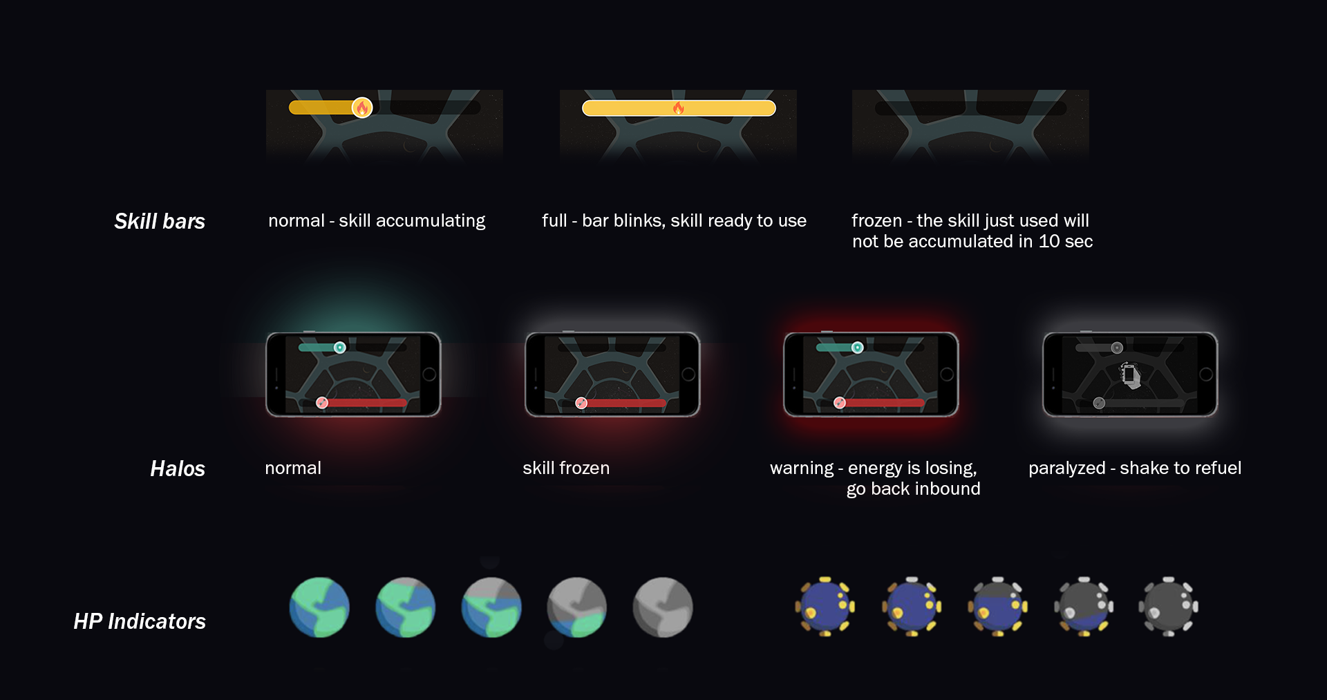
Principle 4
Keep it simple before/after the game

Then I crafted the basic user flow and wireframes for the entire game application, keeping it as simple as possible within technological constraints, and fair to both players.
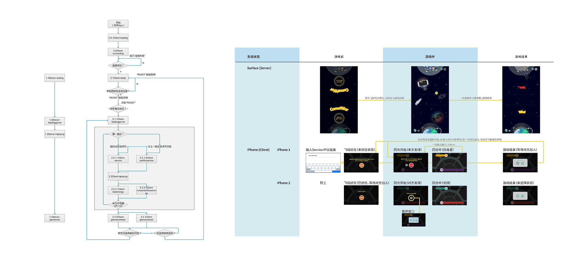
The task-based flow (left) and the wireframes (right) shows how two players operate CometWar before and after the game through interactions with their phones and the PixelSense. The diagram on the right was made for software development in the game making process, and not all design were coded. Thus the screens have different levels of fidelity.
Visual design

1.
As the story happens in the space, the other designer, Yanhang, and I started to look for inspirations. We decided the visual style would cute and neat.
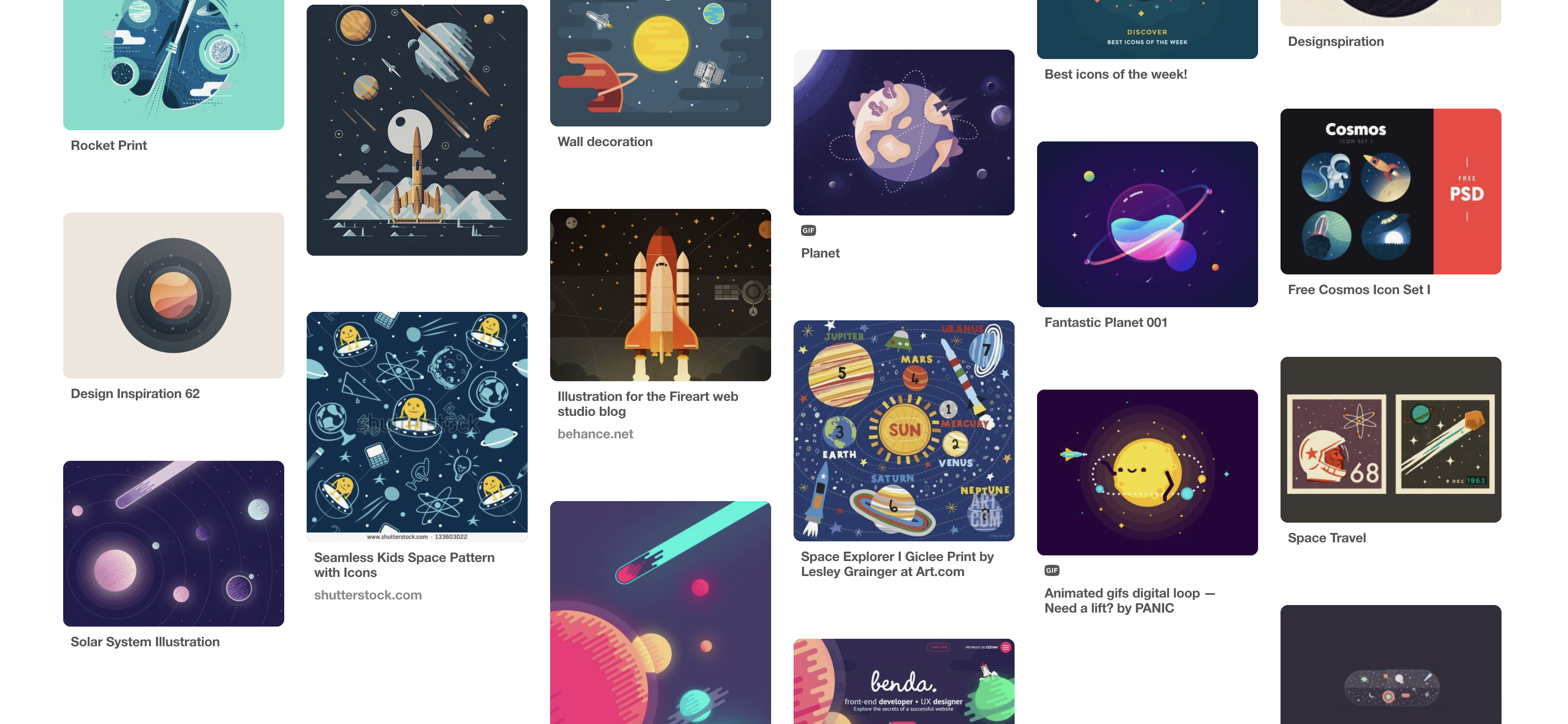
A Pinterest board of collected related images, which helped us design the planets, comets, and other elements in the game.
2.
My partner did the sketches for the essential elements.
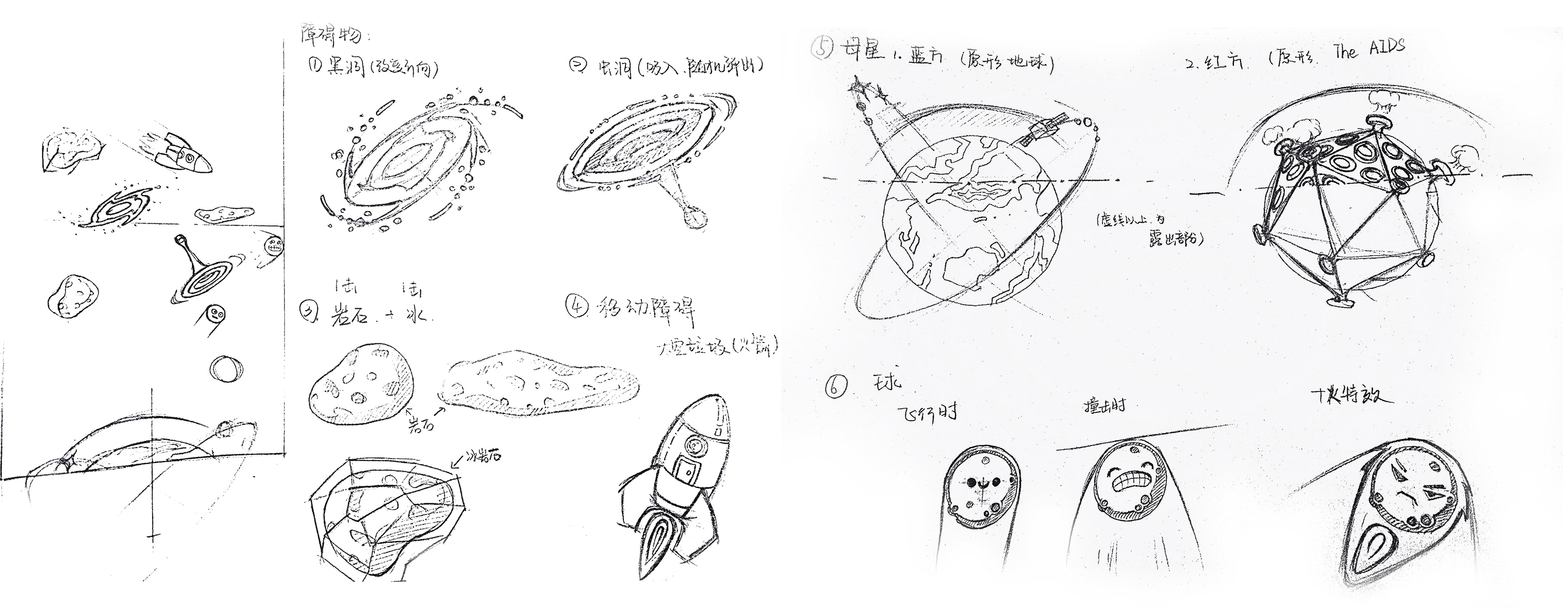
Sketch by Yanhang Jin.
3.
Since different elements exist at the same time, we set the general visual characteristics of those elements, leaving the specific colors to be chosen gradually.

Left: Obstacles and skill icons; Right: color palettes and fonts. The planets and comets were be bright in order to be conspicuous on the dark background. The colors of different planets and skills were of high contrast, easy to distinguish. The obstacles were be gray and in harmony with the background, yet still visible. I also picked Chinese and English fonts that align with the visual style.
4.
Illustrations of the elements ("sprites," for the developers) were moved from paper to screen. We then made animations and made "sprite sheets" for development.

Demo
A demo was coded by the developers for the thesis show.
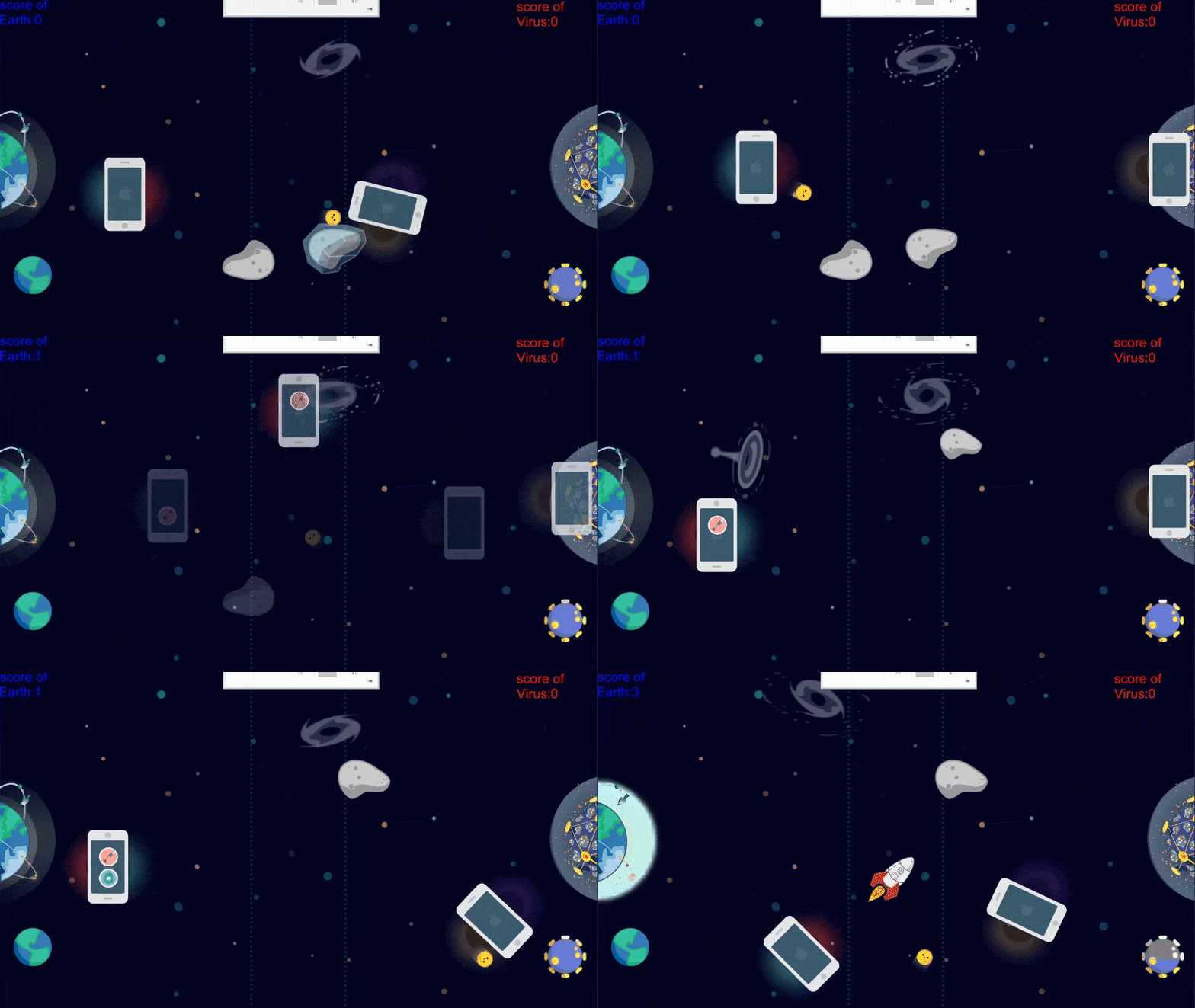
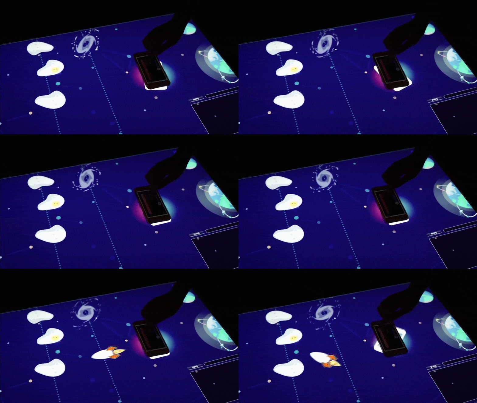
Demo running in Unity 3D (left) and at the exhibition (right). The demo did not include all before/after game states in the flow. Also, because the environment was not dark enough, the PixelSense could only recognize shapes of objects on it but not differentiate the two phones. An AI was built to play with only one gamer.

